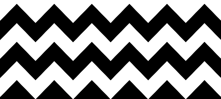
It is enough to just take a glance at what shops with interior design accessories offer to notice that the geometrical style is in. Black and white zigzags, the so-called chevron pattern, is omnipresent these days.
Do you know where this motif come from? The pattern is so simple that it was already used in Neolithic period on ceramics. It emerged again in ancient and medieval art (for instance details in gothic architecture), yet the most prominent and most interesting, in my opinion, flourish of geometrical ornaments based on triangles came with the late 19th and early 20th century.
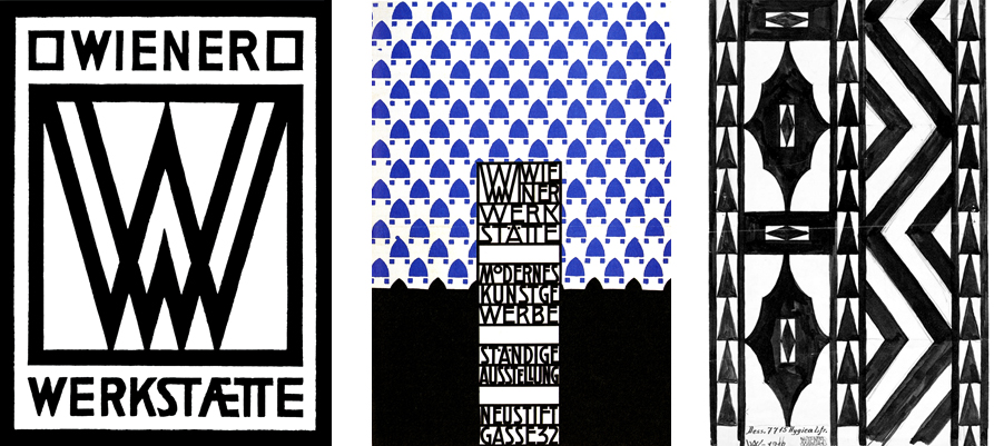
It was then that Vienna’s Workshops (Wiener Werkstätte) started – a workshop established in 1903 by Josef Hoffman and Koloman Moser. The style that came to life then was a reaction to secession. As you surely know, the basic characteristic of secession (art noveau) was flowing, flexible line, floral ornaments, asymmetry and pastel color palettes. Vienna secession was quite different, introducing geometry, symmetry, simplified forms and bold, geometrical typography. The colors were brought down to basics too, with black outline to mark contrast. Vienna’s Workshops inspired creation of various forms of design: posters, advertisements, covers, postcards, objects such as furniture, ceramics, textiles and many more. They were all consistent in style, elegant and functional. Artists from Vienna’s Workshops were active over 100 years ago but they made an important, lasting mark in history of art, as they are seen as precursors of Art deco. Below you can see some examples:

Hype for black and white stripes came back in the second half of 20th century. Various stripes were used in the 60s popular op-art style. In the 70s an Italian fashion designer Ottavio Missoni created a collection based on highly contrasting zigzags. The motif was also used by the distinguished film director David Lynch, allowing to create a really psychedelic effect:

Below, two examples of beautiful ceramics decorated with geometrical patterns, half of the 20th century:

Today, the chevron pattern is everywhere: on pillowcases, plant pots, some even simply frame a print of it and hang on a wall. Unfortunately, when there’s too much of something, it can easily become boring. Cheap, mass production often leads to low quality and art can easily become rubbish. Let’s remember it’s not always good to blindly follow trends 🙂
