

Classical covers of the British publishing house Penguin has for good settled in the history of graphic design. Romek Marber has a significant part in this great achievement, a Polish designer who in 1960s created for Penguin one of the most popular crime book series.
Marber was born in 1925 and after the War he migrated to Great Britain. There, he first attended St Martins School of Art, then moved to Royal College of Art. In the 50s he already established his own graphic design studio and worked for The Economist, New Society, The Observer Magazine.
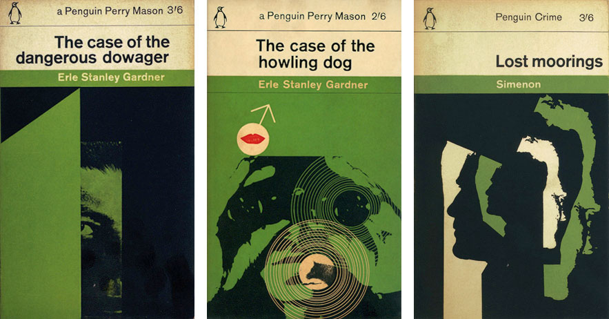
In 1960 Germano Facetti became the art director of Penguin publishing house and he was the one to commission from Marber a layout for crime series. Here is what Marber himself says about that time: ‘In those years cover layout drifted helter-skelter from one project to another, diluting identity and reputation of the publisher. I concluded that the new design should connect all the titles of a series. This can be achieved by visual uniformity of most elements that consist In the cover. The grid will divide the cover into fields of green and white, it will define the typography, its layout and position of the illustration. It is especially important if the illustrations are done by different artists.’
Romek’s new layout idea was received enthusiastically in Penguin and he immediately got new commissions for more titles. In total, he created 70 cover projects for crime books and the whole layout of the series is treated as one of the most important achievements in the history of British graphic design.

Marber’s green series covers are a combination of a very simple, classical composition and typography with dynamic, modern illustration. And the illustration is the dominant in each of these projects. The power of Marber’s designs lies in their simplicity: austere, sans-serif font (Akzidenz Grotesk) and color palette narrowed down and based on strong contrasts splendidly matches the mood of crime novels. Green color is in this case a breathe of freshness and modernity, and made Penguins crime stories immediately noticeable among thousands of other books on bookstore shelves. A large merit to the whole layout is also the so-called flexibility, the capacity of the series. It was created in such way that it could contain tens, or even hundreds of titles not exposing itself to boredom and likeness of the covers to come. There was space for different illustrations by different designers and what follows – each in different style and technique. If we take a closer look at the illustrations in Marber’s series we can notice that some are more like drawings, while other are more like photography or collage. All illustrations have visibly common traits – strong contrast, dynamic compositions, simplified motifs, bold, strong crops on the illustrations. On many covers motifs are shown fragmentarily, which underlines their mysterious character. And of course all that is submerged in green, like a night vision image – as befits a crime story.
By the way – Akzidenz Grotesk was created by the end of 19th century and was one of the first sans-serif fonts. In the half of the 20th century it also became an inspiration for the popular nowadays Helvetica. This font can thus be seen as a combination of tradition and modernity, and in this regard it fits Penguin’s projects greatly – a bit retro, a bit avant-garde 🙂


From November 2015 to March 2016 Romek Marber’s works were exhibited in Galicia Jewish Museum. Here’s a report from the event:
text by Anna Klos
translation by Karolina Klos