Everyone has a favourite colour – mine is black. Black is fascinating, perhaps because it has many meanings that can be juxtaposed. In western cultures and in Poland it is associated with sadness and mourning – it is the simplest connotation. It is also the colour of elegance, luxury, independence and power. In China black symbolizes happiness, in Japan – nobility and maturity, while in ancient Egypt it was the colour of life. Black expresses both modernity and tradition. Now you know why Retroavangarda logo is black 🙂
It is a colour favoured by artists, designers, musicians and actors. It is said that black is the colour of the soul, it underlines one’s personality, adds a veil of mystery and drama. Take a look at the cover below. Minimalist in its form, the design combines raw, sans serif typography and strongly exposed name: BECKETT, while he himself is visible above, immersed in blackness… Thanks to this, there is an illusion of change of scale and the figure of the writer seems big as indeed, a great poet he was. The omnipresent black gives a feeling of dignity and drama. Abandoning the use of other colours and elimination of unnecessary elements fits Beckett’s literature ideally, as it also is stern, deep and devoid of any decorations. And this is why it is so powerful. The case is similar for its cover design reducing colours has enhanced and enriched the project.

Since I mentioned at the beginning that black is my favourite colour, I should perhaps explain why, and how I personally perceive it. From a philosophical angle, black is for me the beginning and the end. Everything comes from blackness and eventually returns to it. Paradoxically, it is both a sum of all colours and, speaking colloquially, is colourless. Black is an essence containing nothing and nothingness that holds everything. It is infinity and Absolute.
Black is a secret. Black is what is on the inside, dark and not yet discovered. Black is a dark corridor, a tunnel, where anything can happen. Black is the Unknown. Black is what is implied, what is not spoken loud, what can be barely sensed, but is intriguing and fascinating. Black, like no other colour, sets emotions free, provokes imagination and directs our senses to feeling. It is also a manifesto of a sort, a voice against everything rubbishly gaudy and overcolourful on the outside – the world of blissful consumerism.

Many artists treated black as a gradual color elimination. This process can be seen as an artistic journey to the very core, exposing the invisible. Black enhances the message. Thanks to it a work of art becomes concise but also stronger in expression. It becomes more intimate, private, noble.
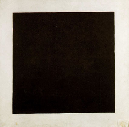
The most famous black painting in history of modern art is surely “The Black Square” by Malevich. It became the symbol of modern art, because it was the first such radical simplification of form. The idea came to the artist in 1913 but he hesitated for two years before exposing it, in fear of its public reception.

Today, there exist many essays on Malevich and his Black Square. The most recent research by experts from Tretyakov Gallery proved that beneath the square there are hidden two other compositions by this artist: a cubofuturistic one, revealed under x-ray, and proto suprematist, discovered under the microscope while looking for craquelures (which is a pattern created by cracked surface).
Russian scientists discovered one more interesting fact. They found an inscription, probably written by the artist himself. It read “Battle of Negros in a dark cave” and is probably some proof of Malevich’s inspiration by Alphonse Allais – one of the first abstract painters, who in 1897 painted a piece entitled “Negroes fighting in a cellar at night”.

Another famous artist who gradually abandoned colours was Mark Rothko. He designed a chapel named after him, in Houston, where his darkest in colour paintings are gathered. Rothko placed great care in every detail of exposition when his paintings were exhibited – especially lightning. And paradoxically, his brightest paintings were strongly lit with fluorescent light, which brought to the viewers’ minds an image of nuclear explosion. In turn, his darkest, sombre paintings were put in dark rooms. It took a few moments before the eye adjusted to the dimness, but the effect was electrifying. After staring at the paintings for a while, slowly and gradually a weird light started to as if emanate from them. Dark paintings from Houston chapel had such effect too: viewers’ experiences were metaphysical, almost religious, some are even said to cry when looking at the pieces. It is amazing how strong emotions art can provoke.
And here is a relevant fragment of speech made by Dominique de Menil in 1971, on the day when Rothko Chapel was opened: “Everywhere where creative people are trying to open a new door, there is always more than meets the eye in an authentic work of art. At first we might be disappointed at the lack of glamour of the paintings surrounding us. The more I live with them, the more impressed I am. Rothko wanted to bring his paintings to the greatest poignancy they were capable of. He wanted them to be intimate and timeless.”

Let’s go back in time to Dutch baroque period. There was a painter Frans Hals, also called the painter of 27 shades of black. He specialized in painting with black colour, obviously. The characters he portrayed usually all have black eyes, dark hair, black hats, clothes, shoes and each of these blacks has a different tone! Similarily to Rothko’s paintings, Hals’ pieces in original are a must-see.

I remember from my university times, that the professor always told us to create the dark parts and shadows with colour, that is to mix different dark paints and avoid using stark black paint, all in the name of achieving a noble, deep tone.
In the history of art there are many famous artists, who on purpose never used black, impressionists for example. Thanks to that their works are more cheerful and full of light. But as I mentioned earlier in reference to Rothko’s paintings – black does not necessarily mean lack of light.
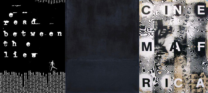
Black in print does not offer as many possibilities as in painting, but it is worth experimenting with it by changing its CMYK values. This way you can create warm, or cold blacks, an additional effect might be also created by introducing varnish, coating or other print techniques. A great example of mastering print might be the poster below. The artist combined different kinds of black, achieving a spectacular effect, where everything pulses like magma.

Blixa Bargeld from Einstürzende Neubauten band sang beautifully about black too, in his dark, poetic “Sabrina”, which you can find here: www.youtube.com/watch?v=CnnGYaqjWA
It’s not the red of the dying sun
The morning sheets surprising stain
It’s not the red of which we bleed
The red of cabernet sauvignon
A world of ruby all in vain
It’s not that red
It’s not as golden as Zeus famous shower
It doesn’t come, not at all, from above
It’s in the open but it doesn’t get stolen
It’s not that gold
It’s not as golden as memory
Or the age of the same name
It’s not that gold
I wish this would be your colour
I wish this would be your colour
I wish this would be your colour
Your colour, I wish
It is as black as Malevitch’s square
The cold furnace in which we stare
A high pitch on a future scale
It is a starless winter night’s tale
It suits you well
It is that black
I wish this would be your colour
I wish this would be your colour
I wish this would be your colour
Your colour, I wish


Somewhere I recall reading that his Black Square was titled GOD. Thank you for this post, I enjoyed it lots.