Jerzy Grabowski is one of the most interesting representatives of geometrical abstract art in European graphics of the second half of the 20th century. In the 60s and 70s he maintained contact with artistic environments from Eastern Europe and he was in the jury of many prestigious art contests. It was his idea to change Polish exhibition “Color in art” into the International Graphic Triennal. Through these exhibitions and thanks to his wide range of contacts he promoted Concrete Art and optical art on Polish soil.
His art has visible influences of the Bauhaus’ color theory, Jahannes Itten, Josef Albers and Max Bill yet at the same time it is absolutely original, unique. His art isn’t easy to understand but it has this quality that the longer we look at it and the closer we study it, the more interesting it gets.
The first time I encountered Jerzy Grabowski was when I was a student – he was my graphics workshop teacher. Now, after many years, I rediscover his pieces with better understanding, analyzing them through the prism of worldwide avant-garde art.
Privately, Grabowski was a very modest person. Diligent and systematic. In his art he was especially consequential. All of his works were confined in thematic cycles, while the cycles consisted in tens of sketches, which in turn were labeled with detailed descriptions. His art is based on mathematical structures. Math itself was an important reference point for him, he also used phenomena of optical illusions (op-art influences).
Jerzy Grabowski is associated mostly with abstract graphic linocuts made of geometrical figures – usually Isosceles triangles. The linocuts seem sterile due to large amount of white spaces (relief embossings) and little bits of pure color.
Striving for order and perfection are the traits of his personality, which find way in his art. While on the subject, this exceptional precision, clean workmanship and attention to the tiniest of details bring to my mind the artworks of another continuator of the avant-garde – Brasilian artist Macaparana, whom I had the pleasure of presenting previously on this blog. Macaparana, just like Grabowski, also appreciates order and simplicity as well as good contemporary art (especially European avant-garde art of the 20s), which is reflected in his compositions.
Here is what Bożena Kowalska, an expert on geometrical abstract art, writes about Grabowski’s graphics:
“All pieces of the artists were a result of strictly realized agenda, which, in turn, was subordinated to the guiding idea of the creator and based on mathematics: on numbers in their logical layouts derived from the simplest actions: addition, substraction or exponentation. Taking a closer look at the drawing sketches of the artist, (…) one might read the encoding system used by the creator. When a square is divided into two triangles it often means unity of oppositions in the sense of a number’s absolute value being the same ex. 1 or 2 but of opposing signs ‘+’ and ‘-‘. When choosing the colors the artist set basic colors (yellow, red, blue) for the additive values of the numbers, and complementary colors (orange, green, violet) for the substractive values. At other times he assigned warm hues to the additive values (red, orange, yellow) and cold hues for the substractive ones (blue, green, violet). It is known that values of opposing signs come down to zero. In many artworks, in the used encoding systems, the artist balanced these opposing values. Also in the use of color. Basic color joined with its complementary color reduces to white when in the form of light and gets close to black when in the form of a paint.
In Grabowski’s graphics, color is present more rarely than in the drawings. In the 1970, instead of encoding with color, the artist started using a technique based on reliefs on the paper, which created convexities and concavities. This relief structure, just like in the colored works, is made of small triangles created by diagonals dividing a square, where all additive values were convexities and substractive values were concavities. This game of oppositions: convexity-concavity, basic color- complementary color, the artist treated not only in terms of art but also mostly in terms of symbolism; as the ultimately synthetic sign, being the reflection of dualism that can be observed in life, like day and night, up and down, good and evil or life and death”.
And here is how the artist himself writes about his use of mathematics:
“(…) mathematical operations are the fundamental technical material, giving me, I suppose, concrete and objective matter. I transfigure mathematical values of mathematical signs into artistic signs – squares or triangles – thus achieving the composition of painting or graphic. In graphics the values of these signs are embossed as reliefs on paper, usually on white Japanese tissue-paper”.
And further on:
“Triangle is the most universal and most perfect visual and “philosophical” form, in my transfigurations it builds mathematical structures of encodings and artistic space of the image in the most concrete way. It connects Earthly reality and the universe. Color is the complementation of the visual form, introduced on the rules of physical knowledge of color, harmony of the spectrum color scheme or the contrast of basic colors and their complementary colors”.
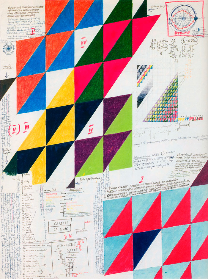
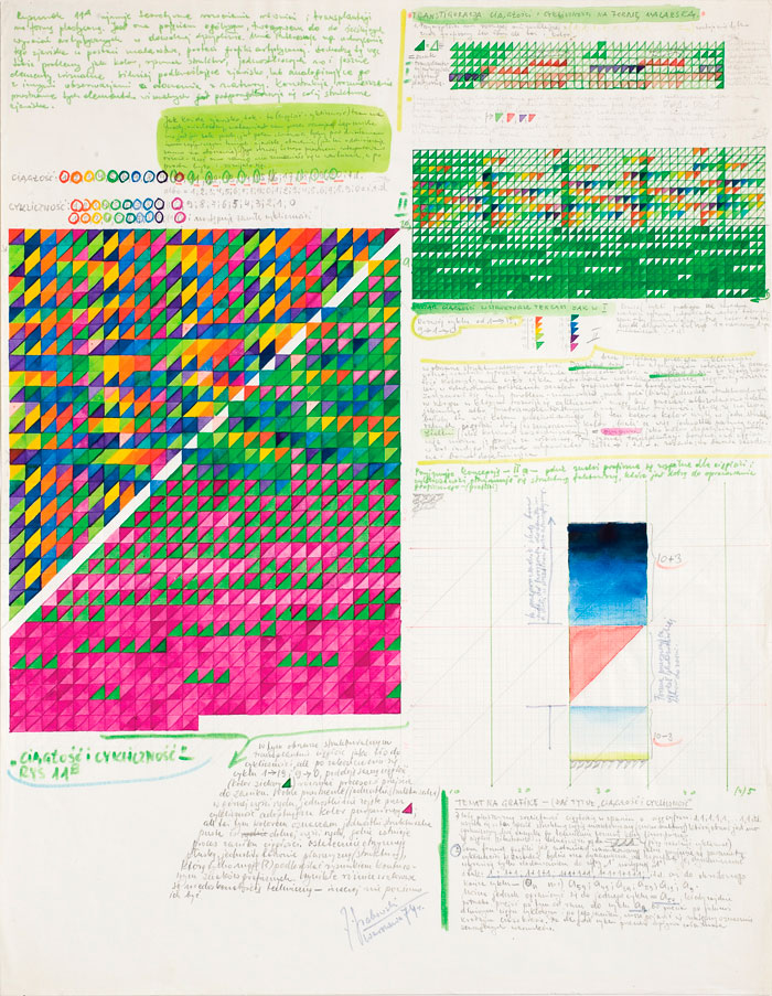
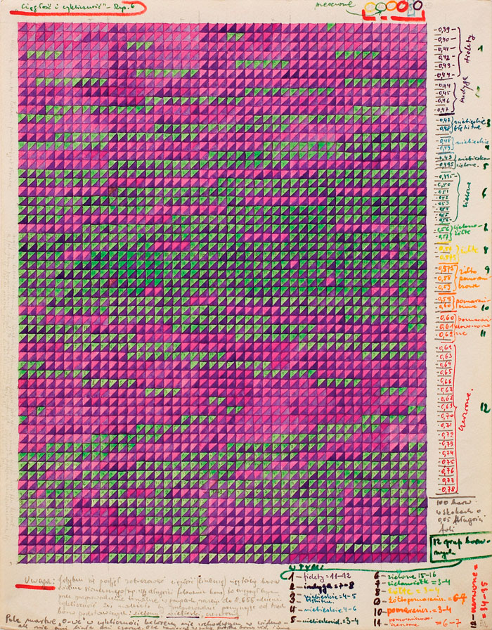
The above descriptions refer to Grabowski’s linocuts – that is, his most famous works collected in museums and many European galleries. It has to be mentioned, however, that each graphic was accompanied by tens of less known sketches and notes. Each graphic was preceded by a fantastic and very rich process of advancing towards the final result. In my opinion, these sketches and drawings are the most interesting pieces in Grabowski’s whole artistic career. They contain personal notes of the artist, often of philosophical nature, as well as mathematical calculations that are the key to understanding of his pieces. They are a registry of the steps towards the final realization, they expose the whole process of creation of the artist’s artistic ideas.
Despite the seemingly sketchy character, these pieces are full-fledged artworks, they are all signed and dated. They are of very personal and free nature, unlike the final, ordered graphics. The final graphics were created using linocut technique and then they were multiplied on manual press with the use of print ink, while the drawings are made by hand and the color was applied with watercolors, tempera, crayons or markers. Grabowski’s sketches and drawings are the key to understanding his artworks and to deeper understanding of the artist himself. As his friend, professor Julian Pałka, used to say: “it is often the way that counts more than the destination”.
text by Anna Klos
translation by Karolina Klos


Pingback: Retroavangarda and Korekta Gallery collection exhibition - Retroavangarda
Pingback: Collection – contemporary art exhibition - Retroavangarda